Introduction to the Online Exhibition
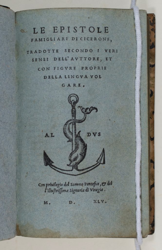
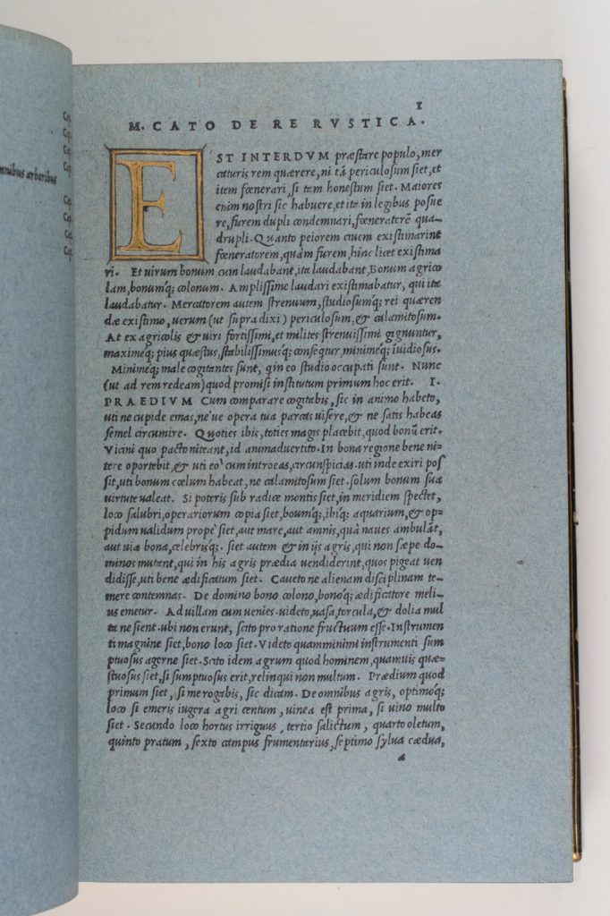
At the turn of the sixteenth-century, handmade blue paper (carta azzurra) emerged as a chosen support for drawing, printing, and publishing in Venice. Blue paper was first codified in a 1389 Bolognese statute that delineated standards for price, weight, quality, and size, was produced on the terraferma, and used widely by Italian draughtsman beginning in the mid- to late fifteenth century. However, the proliferation that took place in Venice between 1500 and 1550 has led to the association of carta azzurra with the northern Italian city. Artists like Vittore Carpaccio (ca. 1460–ca. 1526), Lorenzo Lotto (ca. 1480–1556), Titian (ca. 1488–1576), Sebastiano del Piombo (ca. 1485–1547), and Jacopo Tintoretto (1518/19–1594) utilised this support for drawings to explore the tonal effects of light and shade on colour. At the same time, publishers like Aldo Manuzio (ca. 1445–1515) and Francesco Marcolini (ca. 1500–after 1559) printed books on blue paper, capturing the interplay of the materials and contents that form the page.
This online exhibition brings together sixteenth-century Venetian artworks on blue paper from international collections, highlighting the readily available material’s efficacy, in concert with a variety of media and for an array of purposes, in conveying tonality through a limited chromatic scale. Including drawings, prints, and books on blue paper, and arranged according to the four themes of The Human Form, Antiquity, Mythology, and Allegory, The Celestial Realm, and Creating Space and Composing Action, this exhibition demonstrates the wide-ranging significance of the material for artistic purposes, spanning an aray of techniques, and subjects. Though, throughout, the function of blue paper is to enhance the tonal range of a composition, the confluence of material and subject conveys the unique intended function and impact of each artwork.
Please note that over time, blue paper often becomes discoloured, appearing to be brownish, yellowish, grey, or green. Though some of the papers in this exhibiton no longer look blue, the material is inherently blue paper, or carta azzurra.
AM
I. The Human Form
II. Antiquity, Mythology, and Allegory
III. The Celestial Realm
IV. Composing Space and Creating Action
I. The Human Form
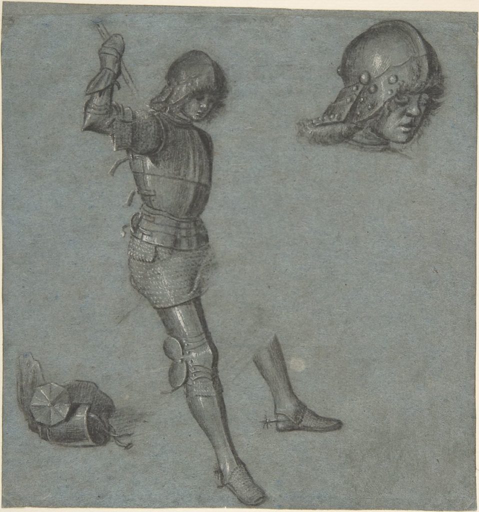
Artists used blue paper as an exploratory medium to study and depict the human form. Through their preparatory drawings, artists like Vittore Carpaccio (ca. 1460–ca. 1526) created sketches to inform their finished works, evident below in this carefully articulated posing of a young man. These drawings served as vehicles of progress towards the finished product.
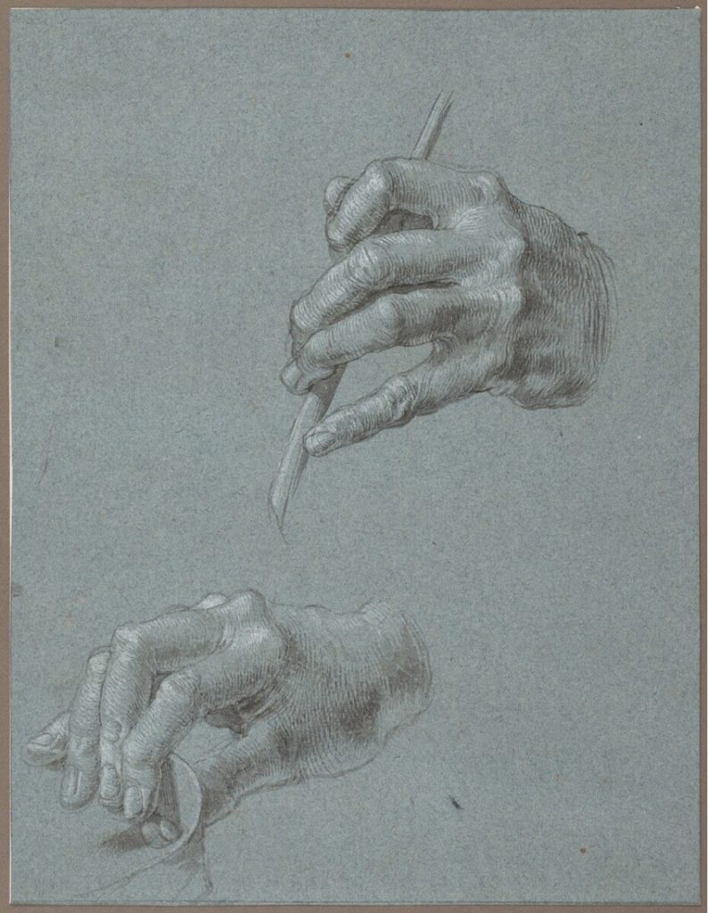
Albrecht Dürer (1471–1528) displayed the artistic advancements that Venice experienced at the turn of the sixteenth century through his documented travels to the city between 1505 and 1507. He studied human proportion and form in his drawings through geometric calculation, and likely returned home to Nuremberg with Venetian carta azzurra. Dürer’s travels and drawings indicate the international significance of blue paper and developing approaches to depicting the human form.
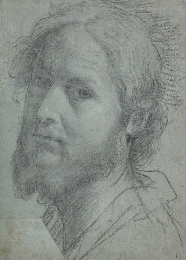
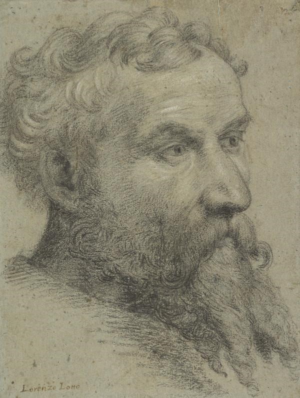
Some artists used drawings to explore colour as a mechanism for depicting the human body. This exploration of colour, light, and shade is evident in Lorenzo Lotto’s (ca. 1480–1556) portrait and Palma il Vecchio’s (1479/80–1528) self-portrait. The textured blue paper acts as a middle tone, allowing for greater possibilities in terms of transforming the colour palette through shading and highlighting. Both of these depictions of human faces capture the diffusion of natural light, therefore defining the figures and softening the drawn lines. The choice of blue paper thus allows for greater naturalism in terms of colour, light, and tone.
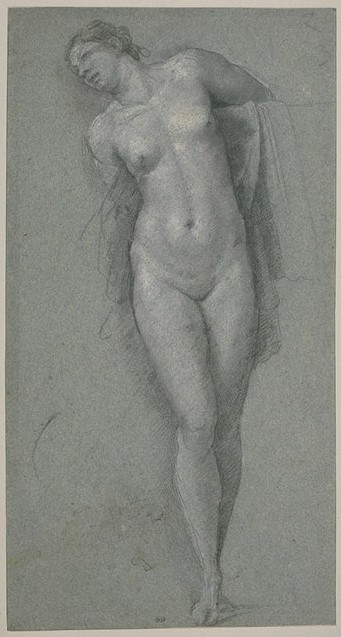
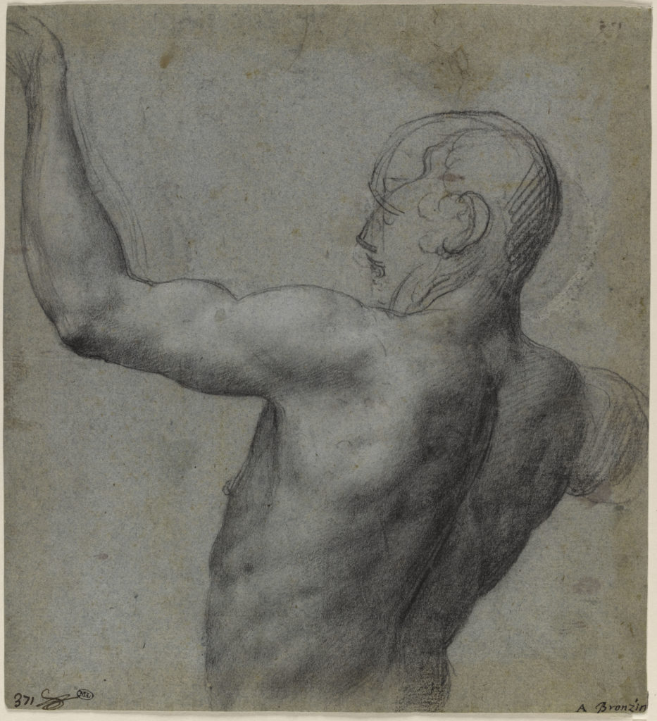
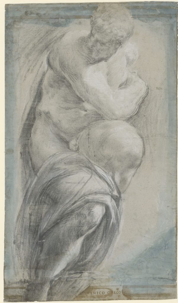
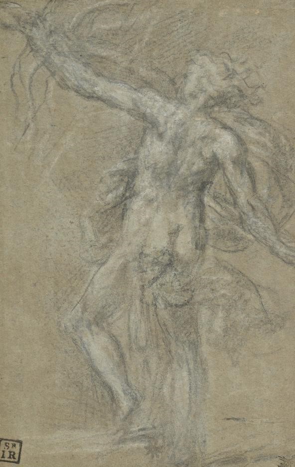
Whether drawing to prepare for a painting, to explore colour, or to study mathematical proportion, artists in Venice used blue paper to further examine and advance their naturalistic depictions of the human form. Battista Franco (1510–1561), Sebastiano del Piombo (ca. 1485–1547), and Vittore Carpaccio render the human body through refined studies of curvature and musculature; Palma, Lotto, and Dürer focus on capturing specific features such as the face and hands. Such artists demonstrate the significance of blue paper in contributing to the representation the most complex of subjects: the human body.
GD
II. Antiquity, Mythology, and Allegory
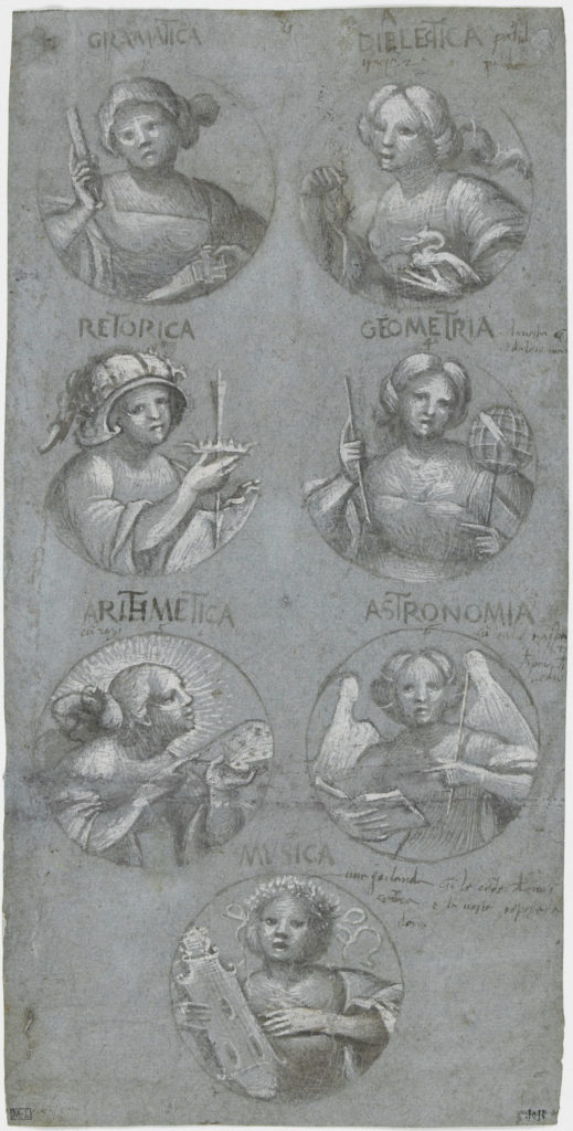
Drawing on blue paper allowed for aesthetic exploration in terms of tonality, style, and composition for depictions of mythological and allegorical subjects, as well as scenes from Roman history. The middle tone provided by inherently blue paper allowed artists to inform colorito through disegno, highlighting the intellectual approach to drawing and manifesting their invenzione. This approach is evident in subject matter and how it is represented through details and stylistic choices.
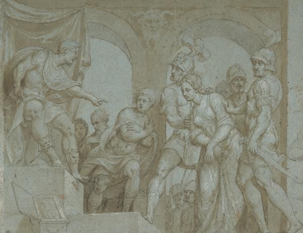
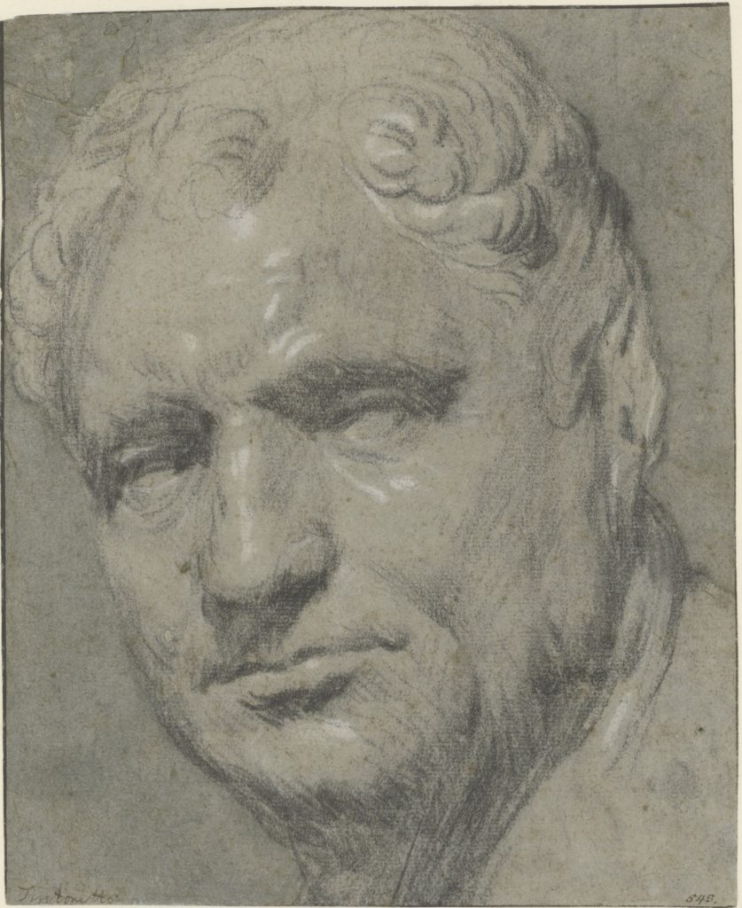
For example, subjects from antiquity such as Pordenone’s (1484–1539) Roman general Scipio Africanus and Jacopo Tintoretto’s (ca. 1518/19–1594) Roman Emperor Vitellius (15–69 AD) are rendered in ways that exemplify the advantages of drawing on blue paper in relation to an envisaged final product. Pordenone demonstrates the gravitas of his subject by depicting a historic scene through his naturalistic and refined use of pen, ink, and wash on blue paper. He heightens the moment’s significance by drawing the viewer’s attention to the interaction of the central figures through light and shade.
Tintoretto uses vigorous hatching, specifically around the neck, in his drawing after a sculpted bust of Vitellius. The artist’s use of white heightening on blue paper strengthens the emphasis on the subject, highlighting his strong facial proportions and expression. Both Pordenone and Tintoretto work to capture subjects from antiquity, whether modeled from life, the imagination, or memory.
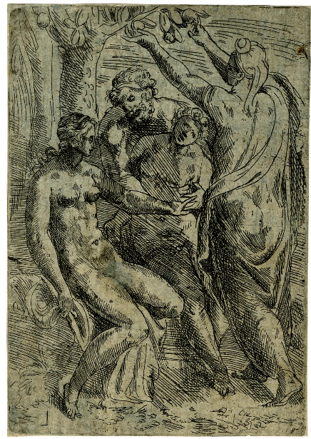
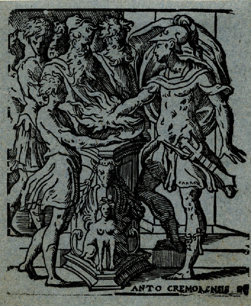
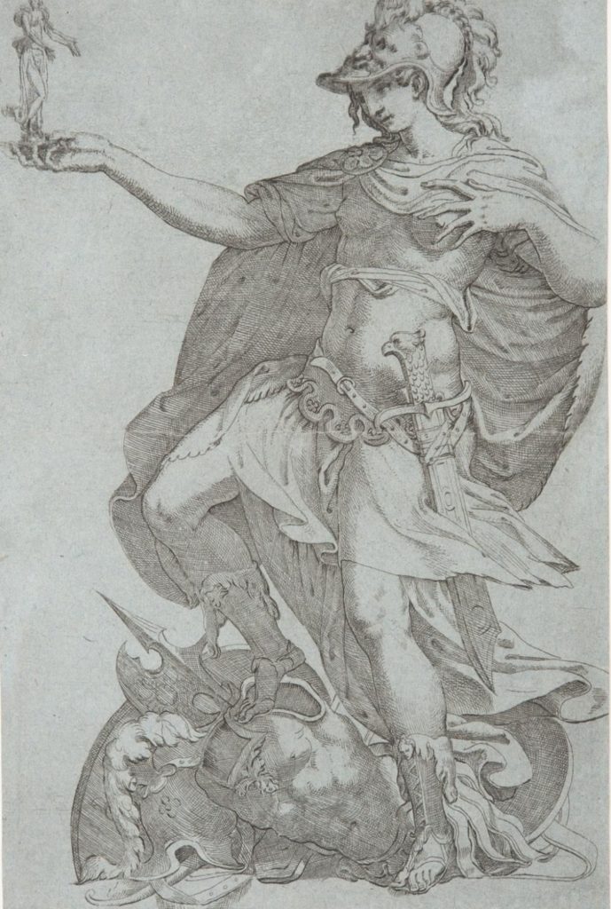
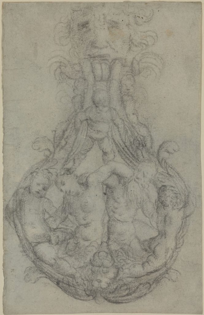
The tonality of blue paper heightens the dramatic impact of representations of mythological subjects, evident in works by Andrea Schiavone (ca. 1510–1563) and Angelo Falconetto (1504–1567). Depicting figures from mythology proved a significant task, involving knowledge of the subject and its symbolic references, such as Falconetto’s inclusion of a small statue of Victory in his depiction of Bellona. Blue paper allows for such explorations in both drawn and printed images executed in vastly different styles; the medium of etching heightens the effects of the hatching in Falconetto’s print, while the design for a door knocker uses blue paper to render an object tangible and sophisticated, showing off the design of a desirable commodity.
GD
III. The Celestial Realm
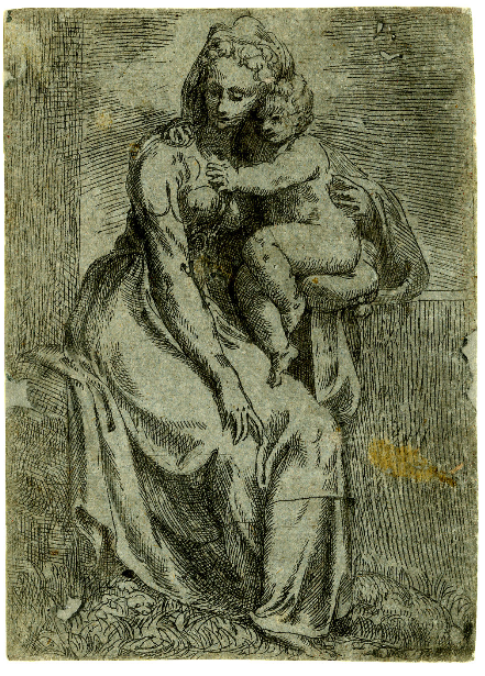
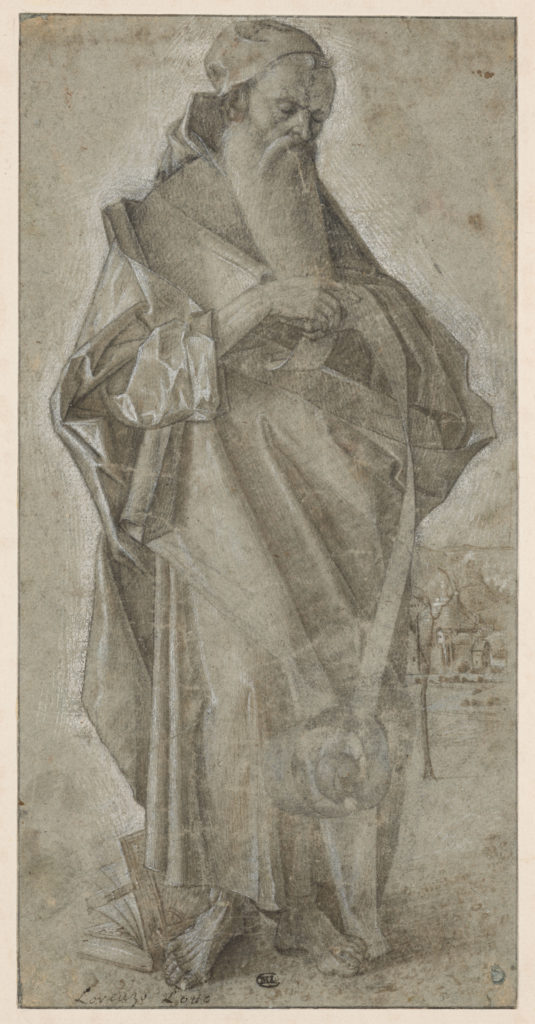
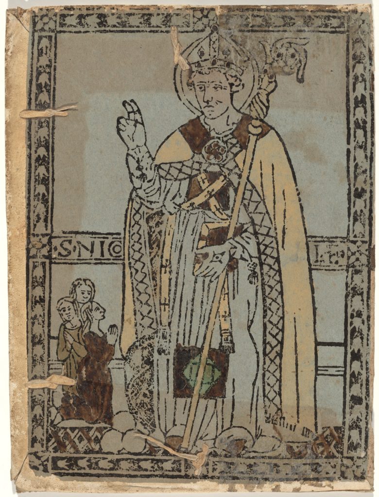
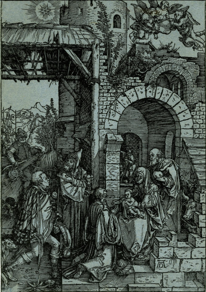
The appeal of blue paper for the depiction of religious figures and subjects was further solidified through the association of the colour blue with the heavens. Blue paper became, with the expansion of printing, a medium through which devotional images could be made available to a mass audience. For Albrecht Dürer’s (1471–1528) Adoration of the Magi, 1503, blue paper revived the worn relief of a posthumous sixteenth-century impression. Other devotional images printed on blue paper were customized through hand-colouring, such as the woodcut of San Nicola di Myra detto San Nicola di Bari, ca. 1475. Etchings, including Battista del Moro’s (ca. 1515–1573) Virgin and Child, make use of the the blue paper background as a delicate contrast to the ink hatching, establishing the religious space as separate from the physical, earthly domain.
The idea of a religious space captured by blue paper is clear in St Zacharia (early 16th century), produced in Giovanni Bellini’s (1431/36–1516) workshop. The blue paper ushered the viewer into the presence of the saintly subject, creating a spiritual realm as an extension of the physical artistic space into which the viewer is drawn by the paper’s colour.
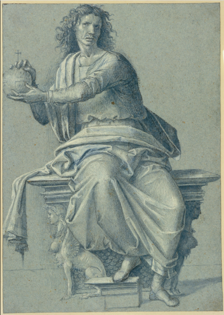
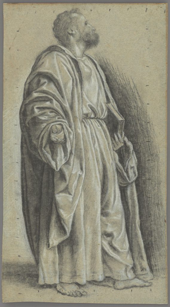
Other artworks of religious subject matter on blue paper served as studies for larger painted works. In Bartolomeo Montagna’s (1450–1523) A Study for Christ Enthroned, the artist makes use of white bodycolour and black chalk to provide contrasts to the blue support, allowing him to establish the fall of light. Giovanni Girolamo Savoldo’s (ca. 1480–after 1548) Study for Saint Peter uses blue paper to a similar effect, while also establishing the position of the viewer in relation to the spiritual space through the use of shadowed contrasts on the blue paper support.
RD
IV. Composing Space and Creating Action
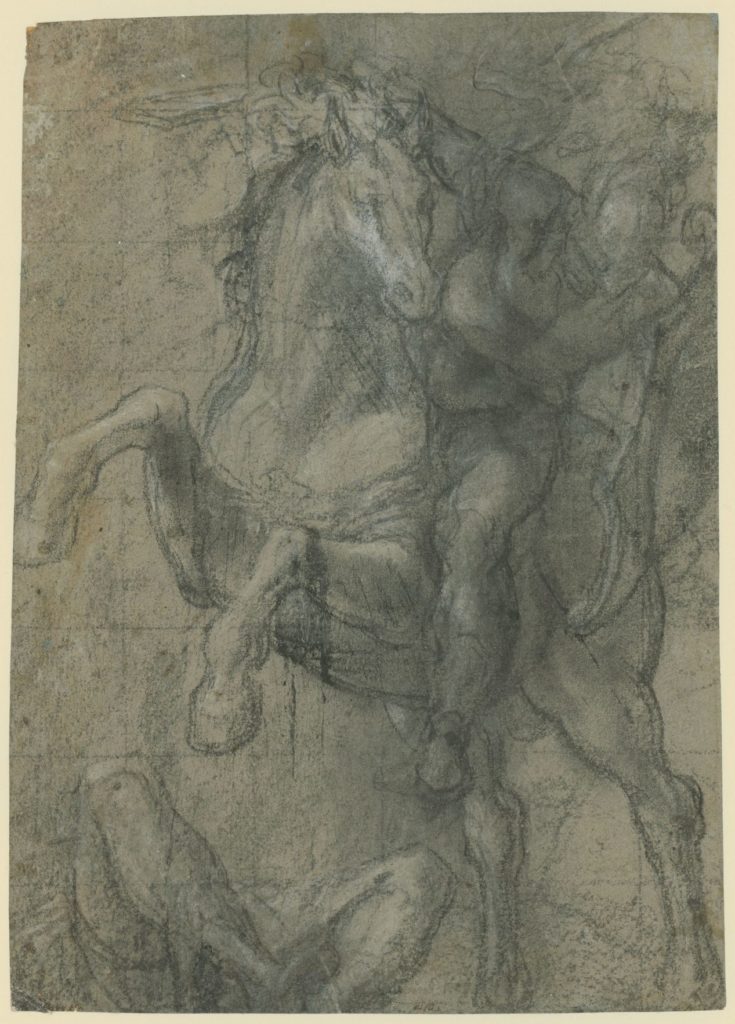
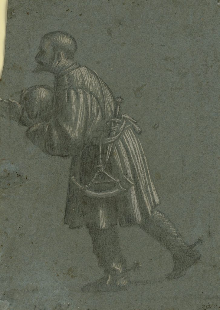
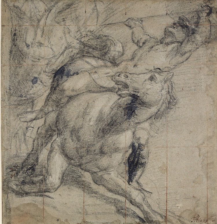
Fifteenth- and sixteenth-century Venetian artists used blue paper as a support on which to create space and articulate action. Blue paper was a useful medium to convey dynamism, as it allows for the exploration of subtle gradations in tone, and, as a result, heightens the plasticity of figures and emphasises the relationships between them. Various techniques were employed to suggest dynamism on blue paper. For example, Titian’s (ca. 1485/90–1576) use of white heightening in Horse and Rider Falling, ca. 1537 emphasises the physicality of movement. White heightening combined with other materials, such as black chalk, clearly develops spatial contrasts, and establishes bold movement, as seen in Andrea Schiavone’s (ca. 1500–1563) drawings. Similarly, black chalk and ink were used to give definition to physical form, evident in Vittore Carpaccio’s (ca. 1460–ca. 1526) Hunter study in which the figure boldly strides forward.
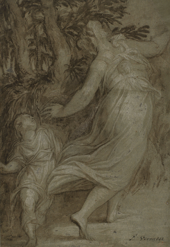
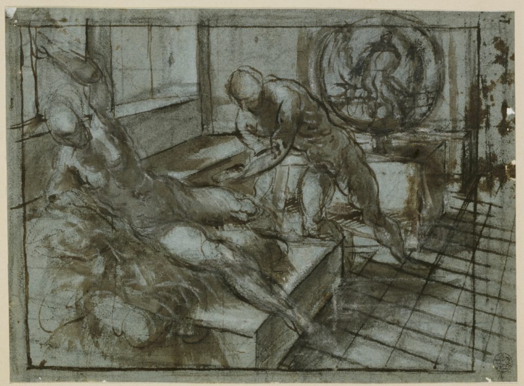
Jacopo Tintoretto’s (1518/19–1594) use of chiaroscuro in Venus and Vulcan (ca. 1545) emphasises the three-dimensionality of the figures within a confined and clearly delineated space. In addition to conveying the subjects’ physical form, the gradation of tones offered by black and white chalks on blue paper enhances a sense of movement through space, as in Schiavone’s A Woman Fleeing Through a Wood (first half of the 16th century). Thus, the blue paper was not merely a vehicle for movement, but was critical to its depiction.
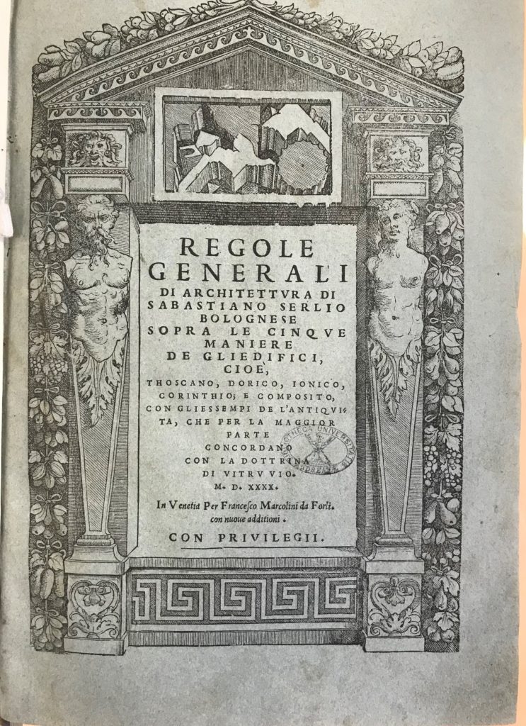
The use of blue paper to capture the relationship between page and form to create space is clear in the case of architectural manuals, such as Sebastiano Serlio’s (1475–1544) Regole generali di architettura. Printing architectural forms on blue paper heightens the interplay of ink on the page by rendering physical space and dimension. Through the combination of text, image, and coloured paper, the book is bound together in visual coherence.
RD
How to cite the Online Exhibition:
Author (see initials in Colophon). ‘Content Title’. Venice in Blue Online Exhibition. Edited by Alexa McCarthy. University of St Andrews, 2021. https://veniceinblue2021.wp.st-andrews.ac.uk/.
